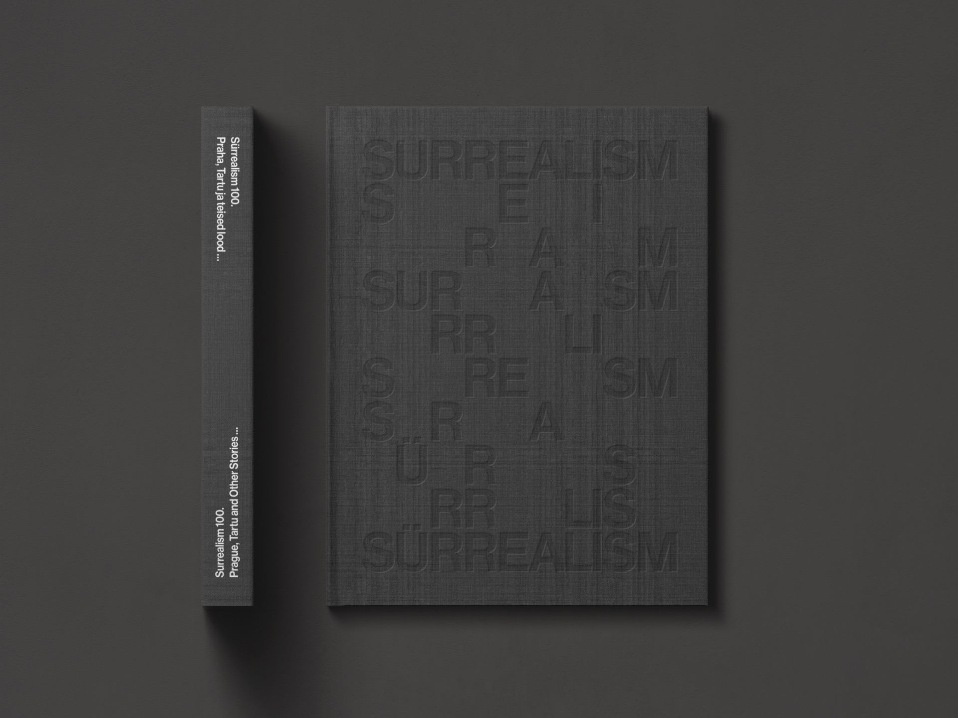
For the book's cover graphics, we drew inspiration from the surrealists' use of automatism – creating a bilingual design with the help of an algorithm that determined the placement of the letters. As you read the middle lines, your brain fills in the gaps.
Since the surrealist manifesto itself was designed to be clear and readable, we decided to keep the books graphic design simple and legible, to appropriately highlight the extraordinary collaboration between the two museums.