Kirjeldus
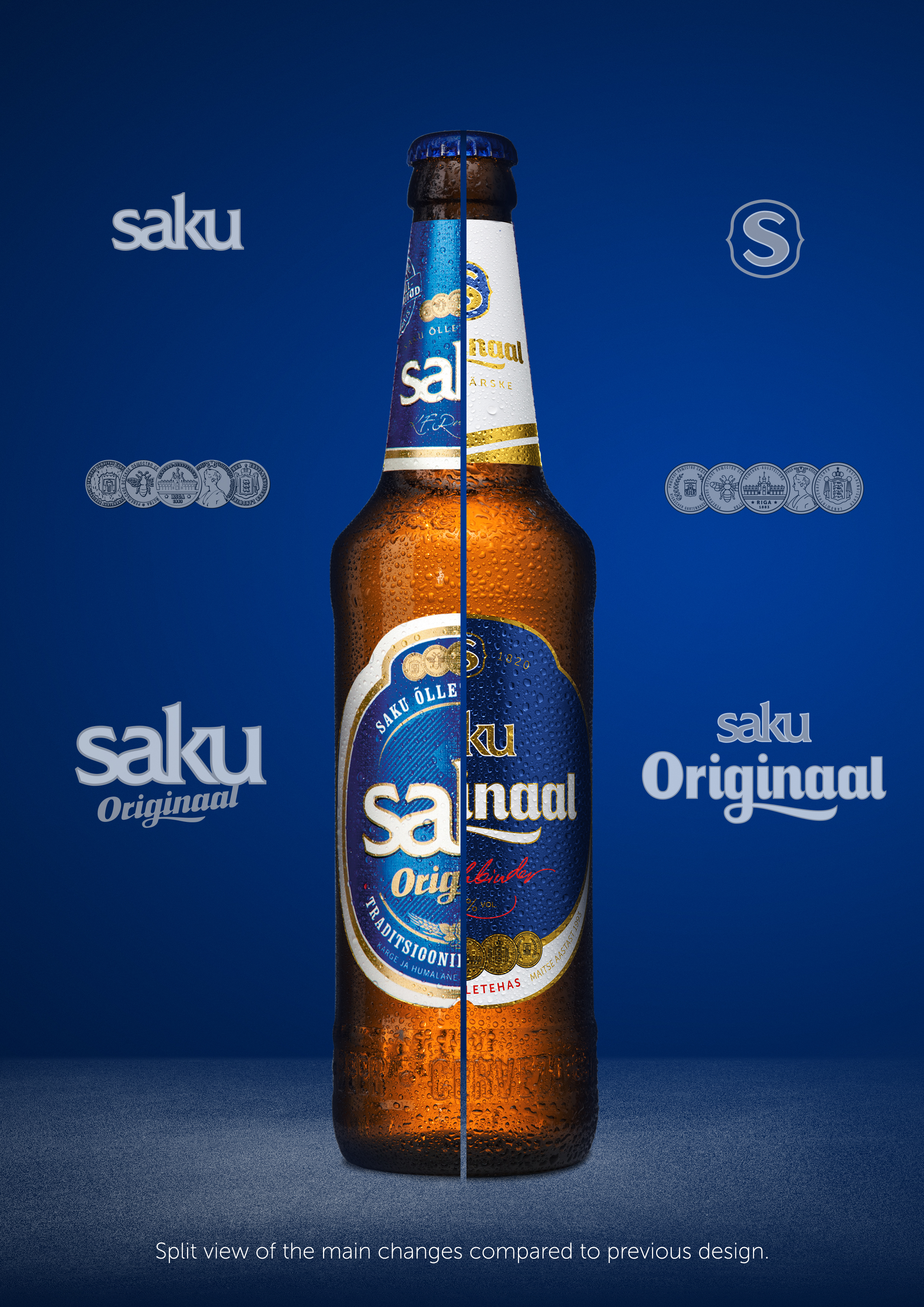
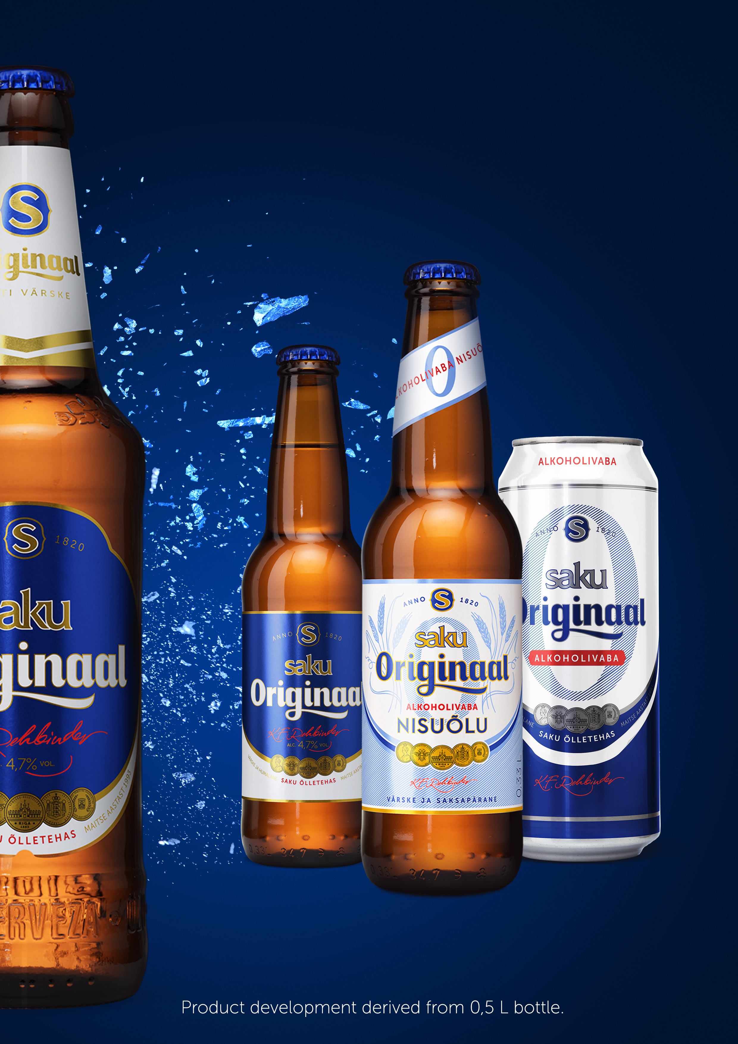
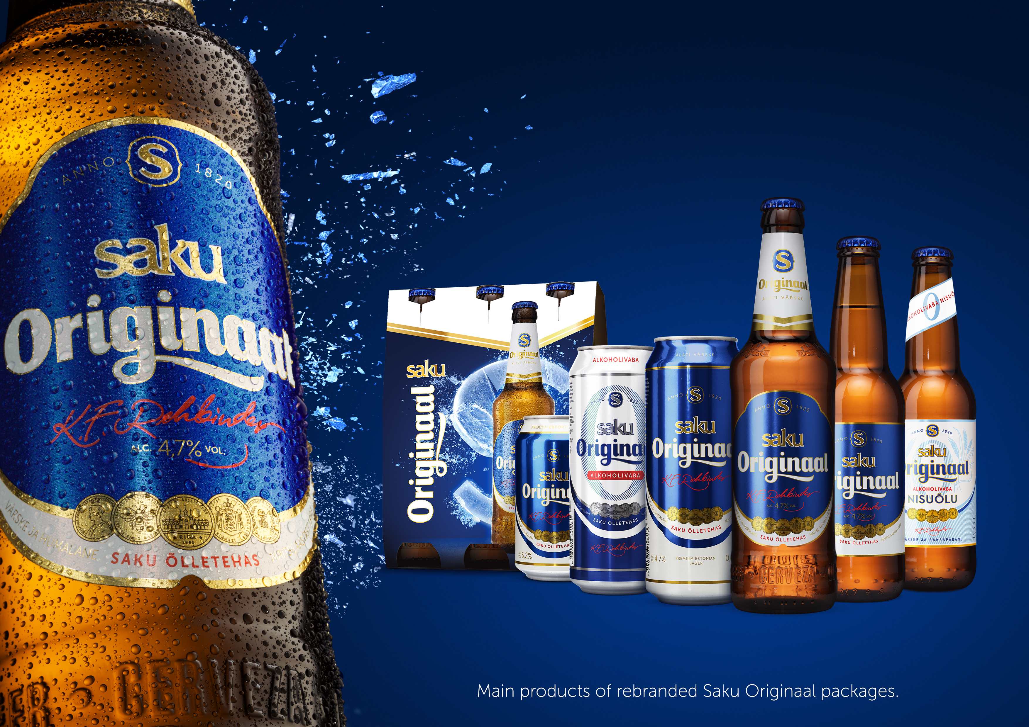
The major beer in Estonia is not the best platform for design adventure – errors mean loss of money. 2016 was the historical year, when Saku Originaal, the leading beer in Estonia, changed its taste and form. It is now more aromatic / hoppy and fresh. Thus, also package had to change. Enough, but just a bit, not to scare loyal consumers. New design had to be suitable for fathers and sons. And also brand extensions, in addition to regular cans and bottles (0.33 bottle, non-alco versions etc.). The old “SAKU Originaal” had to become “Saku ORIGINAAL”, to highlight the brand. Role of white colour increased and design was fresh. Also the new signature of Original brand “S” was applied. Shape and print technology of label, bottle and can had to remain the same.
-
Art director
-
Creative director
-
Project lead


